Creating a dash page
is the first step to creating a themed planner.
Lately I've been
browsing Pinterest for some planner inspiration, and I've come across some
beautiful things. Some of these planners
blew me away, leaving me wondering how
does someone even get started with theming a planner (???)
Follow Arcadia Page's board Printables on Pinterest.
Well, I stumbled
across a clue. Lately many planner enthusiasts have been into creating what
they call a "dash page."
A dash page is
basically a plastic sheet near the front of the planner that holds stickers,
sticky notes, and other decorative items that will be used in the planner.
Having a dash keeps these different parts easily accessible. For example,
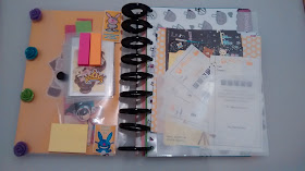
here's the dash for the disc bound planner I'm working on.
My dash page is
basically a plastic pocket with some cool artwork on the inside and stickers,
watashi tape, and sticky tabs on the outside. Also in the pocket are more
stickers and 3D scrapbooking items. Although it is a mix of stuff, they all
have the same general feel and similar color scheme.
This is my new DIY diskbound planner, BTW.
This is my new DIY diskbound planner, BTW.
As I was creating
the dash, I was going through my collection of scrapbooking stuff to see what
fits the atmosphere of this page and what didn't. In the end, I had a clearer
idea of how I wanted this planner to feel. The main colors ended up being
orange, black, and purple, with highlights in bold shades of blue and pink. No
pastels in this one.
Creating a dash page
helped make my planner more of a work of art and less of random things here and
there.


No comments:
Post a Comment